Sunday, August 28, 2011

Experiential Narrative


The underpass will be a focal point not only in the daytime, but at night as well.  As the user comes upon the underpass in the day, the structure will look as if it falls into its surroundings.  And as day turns into night, it becomes a stronger, independent entity.  Inside the mood will shift from intimate and peaceful during the day, to bright and exciting in the evening.  The idea is that the underpass itself will act almost as a living thing that is slowing gaining strength and intensity as the day wears on and into the night.  The main reason behind this is practicality.  The sun will be the main source of light during the day and at night electrical lighting will take over allowing for a safer passageway for pedestrians.

The colors used in the passageway will reflect the surrounding conditions of the land.  Earth tones will be used in order to better blend the manmade structure within its natural environment.  Our goal is to use color to accentuate the overall experience we are expecting the user to have while actually in the space.  By using, low contrasting colors in the scheme of the overall environment, the structure will recede during daytime hours.  At night, high contrasting colors can be used to better separate the structure from its surroundings.  The more emphasis placed on the structure at night will aid in allowing the underpass to shine as an independent being.  With the assistance of the application of light in the space, we can create two distinct versions of the same passageway.

Color Study


The color scheme we wanted to follow was one that picked up the colors and tonal qualities of the surrounding area.  Therefore, we chose core colors such as yellow, brown, and red.

Contrast + Dominance Scheme:  We chose light and dark colors for this scheme.  Yellow was to be the dominant color with the dark and light grays working as contrasting colors.


Proportion + Intensity Scheme:  Again we chose the yellow as the main color and the red as a sub-donimant color. The brown will be an accent color.


Thursday, August 25, 2011

Make it work!


Image Source:  Washington Post  http://www.washingtonpost.com/wp-dyn/content/gallery/2010/08/05/GA2010080505075.html


I think using plastic bags or painting tarps will help Ino and I convey how we want the interior space to look regarding light.

Precedent Study

Tara Donovan, Untitled (Styrofoam Cups), 2008


Image Source:  "I like this art" Contemporary Art Blog   http://ilikethisart.net/?p=4277


Photo source:  Museum of Contemporary Art San Diego  http://www.mcasd.org/images/objects/323.jpg


This particular artist creates large scale installations out of ordinary objects.  This piece is made entirely of styrofoam cups and hot glue.  I enjoy the texture created as well as the ethereal glow emanating through the cups.  

James Turrell, Sky Pesher, 2005

Interior view of James Turrell's <span class="wac_title">Sky Pesher</span>
Image Source:  Walker Art Center  http://visualarts.walkerart.org/detail.wac?id=2530&title=acquisitions

Turrell's manipulation of both natural and electrical light is the focus of Sky Pesher.  The light coming from the skylight and the accent light along the datum create a soft, warm glow in the space.  

Office dA, Helios House, 2007 

bps gas station of the future los angeles
Image Source:  Design Buzz  http://www.designbuzz.com/entry/office-da-grows-novel-with-eccentric-construction-usage-and-architectural-designs/


bp-helios-house-003.jpg
Image Source:  Mental_floss Blog  http://www.mentalfloss.com/blogs/archives/5267


This BP gas station is the first LEED-certified gas station in the nation.  It is made up of recycled glass and stainless steel scraps.  The multi-faceted reflective surface reacts to the natural light in an interesting way.


Greenway Project: Phase 1

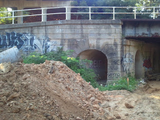
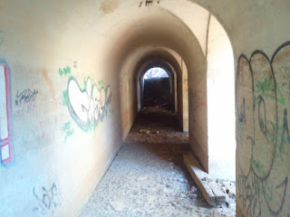
For our first project, we designing a pedestrian thoroughfare as part of the Greenway Project.  The Greenway will be a 4 mile-long loop around the heart of downtown Greensboro that will serve as an alternative transportation route for Greensboro citizens.  The Greenway is split into 4 sections with a cornerstone marking the corners of the path.  The section that will be the focus of our particular project will be the Motion Cornerstone located on the Southern Trail, specifically the abandoned railroad pass.  The following are preliminary ideas for repurposing the underpass.


Site Photos


Color in Architecture + Light Revealing Architecture


In determining the genius loci, light and color are the most defining factors.  The light in which a certain environment is viewed, determines how the viewer perceives that space, whether it is cool or warm.  The color of a space depends what type of light it is cast in. Because of this, both light and color can be defined as two interdependent features:  one cannot be applied without due consideration of the other. 
            Though light and color are two important elements in designing an environment, the environment itself should be examined to determine how light and color can be used to enhance to raw beauty of an individual space.  Rasmussen noted that it is unwise to deceive the occupant with tricks of color.  Instead, it is better to focus on the positives of the space.  For example, a large room should be celebrated with light colors emphasizing its size and vice versa.  By employing a color suited to the space, one can control the experience 
Marietta Millet states that by studying how light is affected throughout the day and in different seasons, one can manipulate an interior to have a certain glow year round.  This can be achieved by directing windows to face a particular direction or by using materials to filter light through.   Also, the climate should be considered as much as the light.  In Japanese culture there is an emphasis on controlling the climate in the summer because of the heat.  They traditionally achieved shielding themselves from the sun by a system of paper-paneled doors that filter in soft light from the outside.   Much like the Japanese, the Dutch use their windows to help maximize light.  Since, most houses are situated in rows, neighbors share walls.  This allows for windows to be positioned only at opposite ends of the home.  To be sure to obtain the most natural light, these windows are typically very large.  The application of light is varies from country to country in order to satisfy their climate needs.